The PoP Shoppe
Packaging Design
As part of a collaborative team effort, we undertook the task of rebranding The Pop Shoppe to create a more youth-oriented and friendly image while preserving its retro aesthetic. The objective was to modernize the packaging to better compete in the market and appeal to a younger demographic, all while maintaining the nostalgic feel that long-time customers cherish.
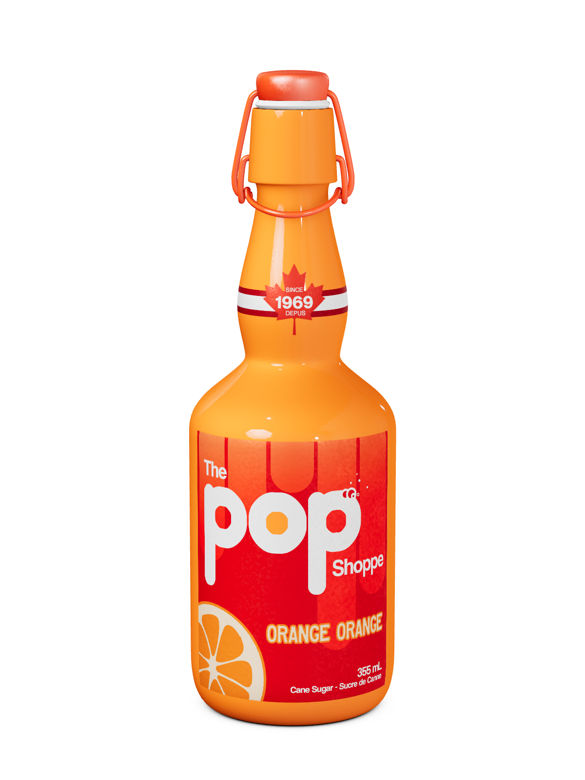
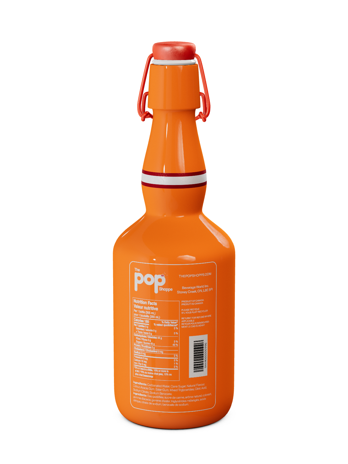
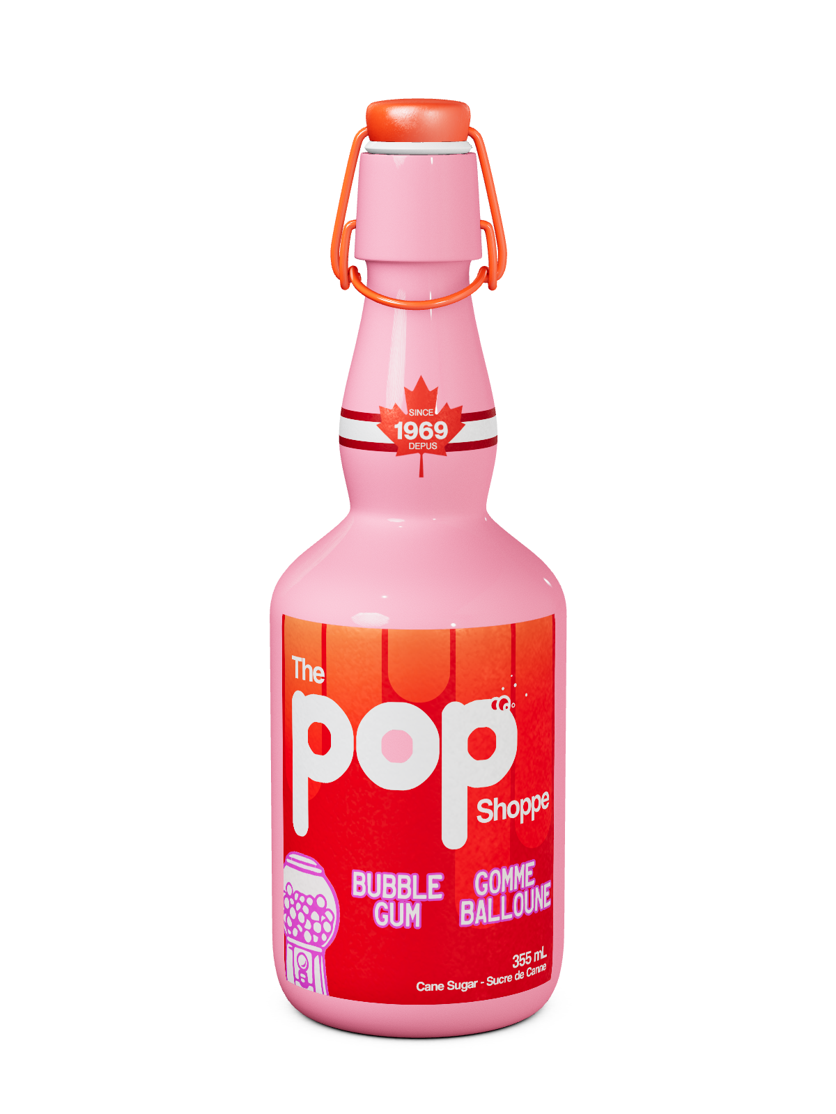
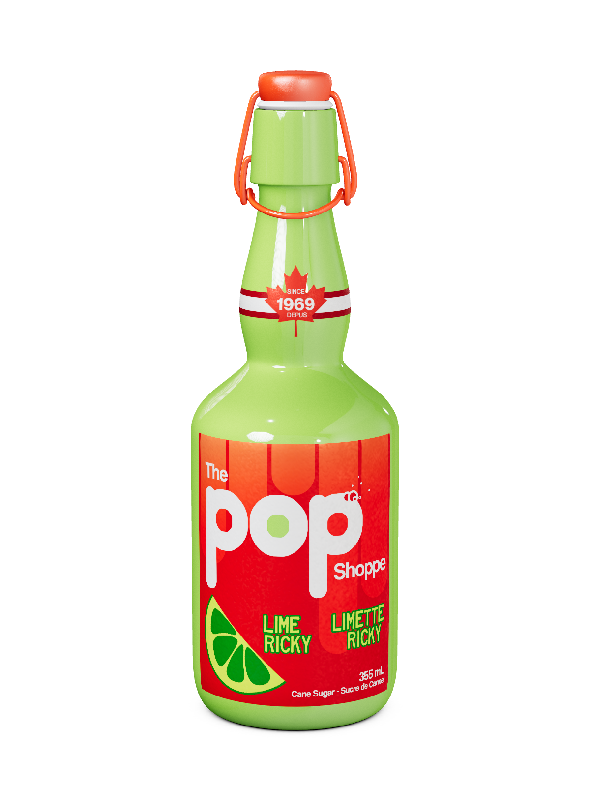
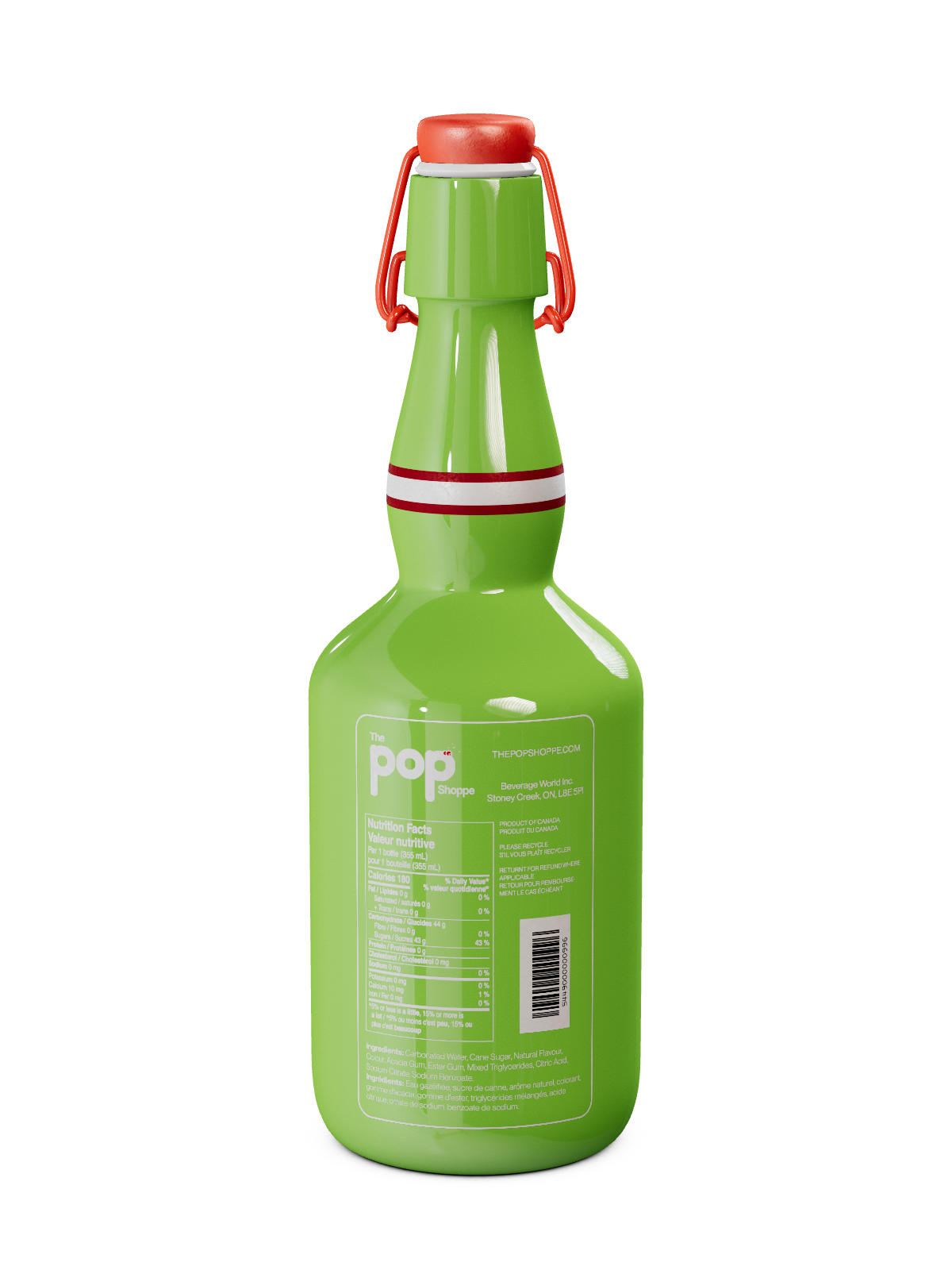
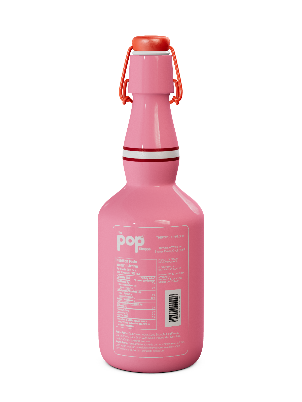
Through multiple design iterations and feedback sessions, we chose a final design that featured a bold and vibrant color palette, with an emphasis on orange to reflect the flavor and attract attention.
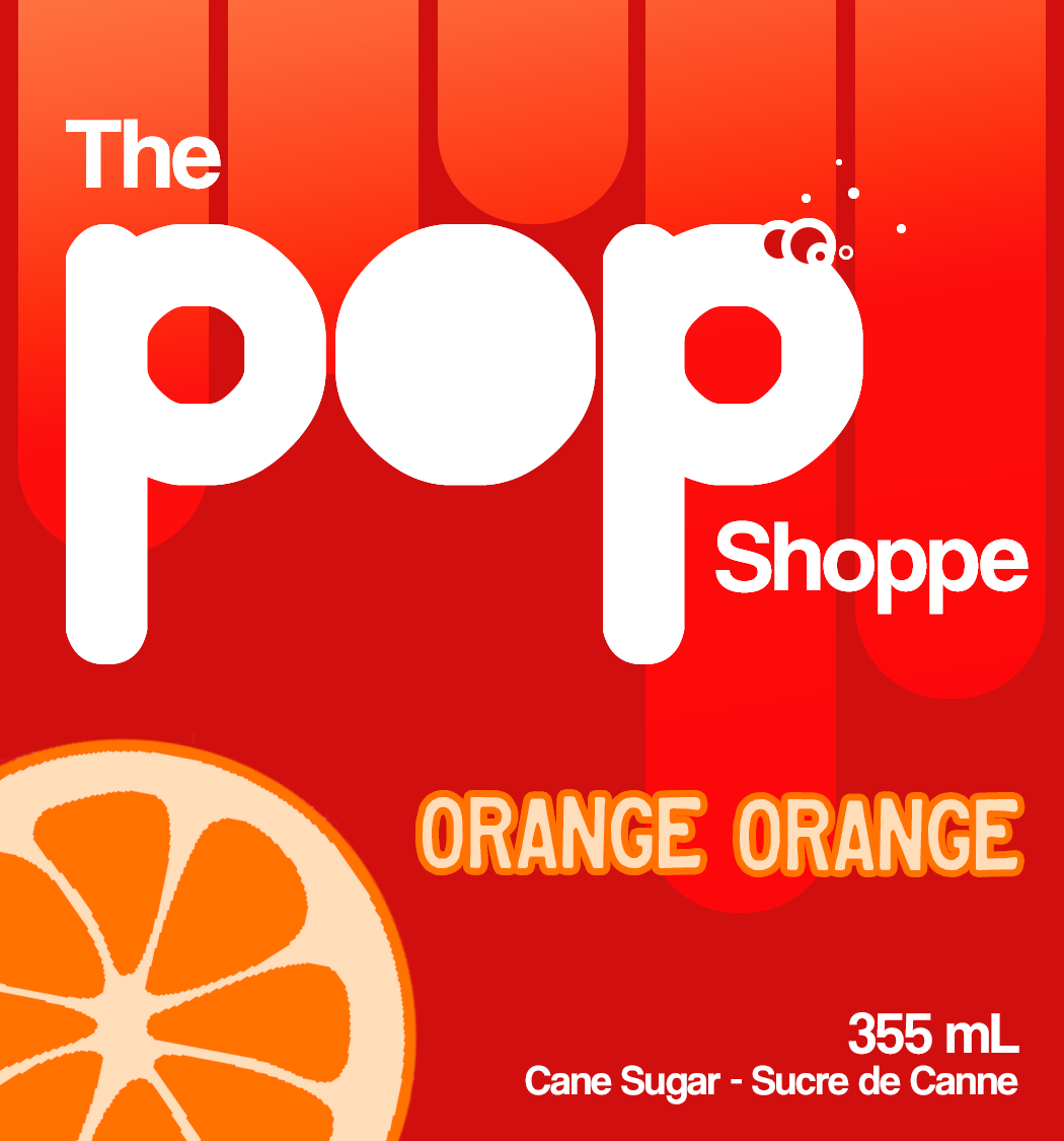


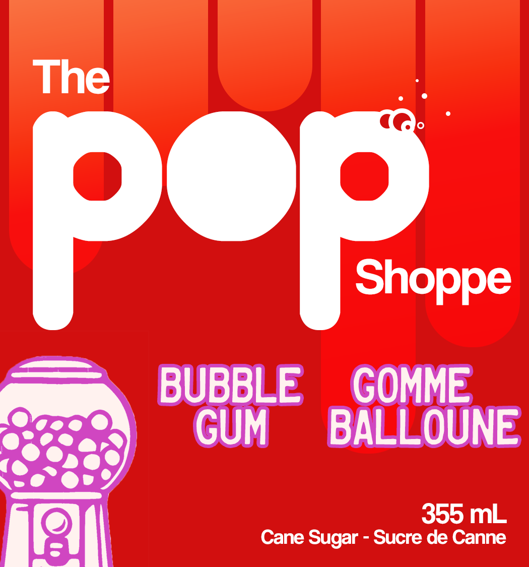

We retained key retro elements such as the classic logo shape and vintage typography, updated with a modern twist, and added playful graphics, such as the stylized orange slice, to enhance visual interest and convey flavor.
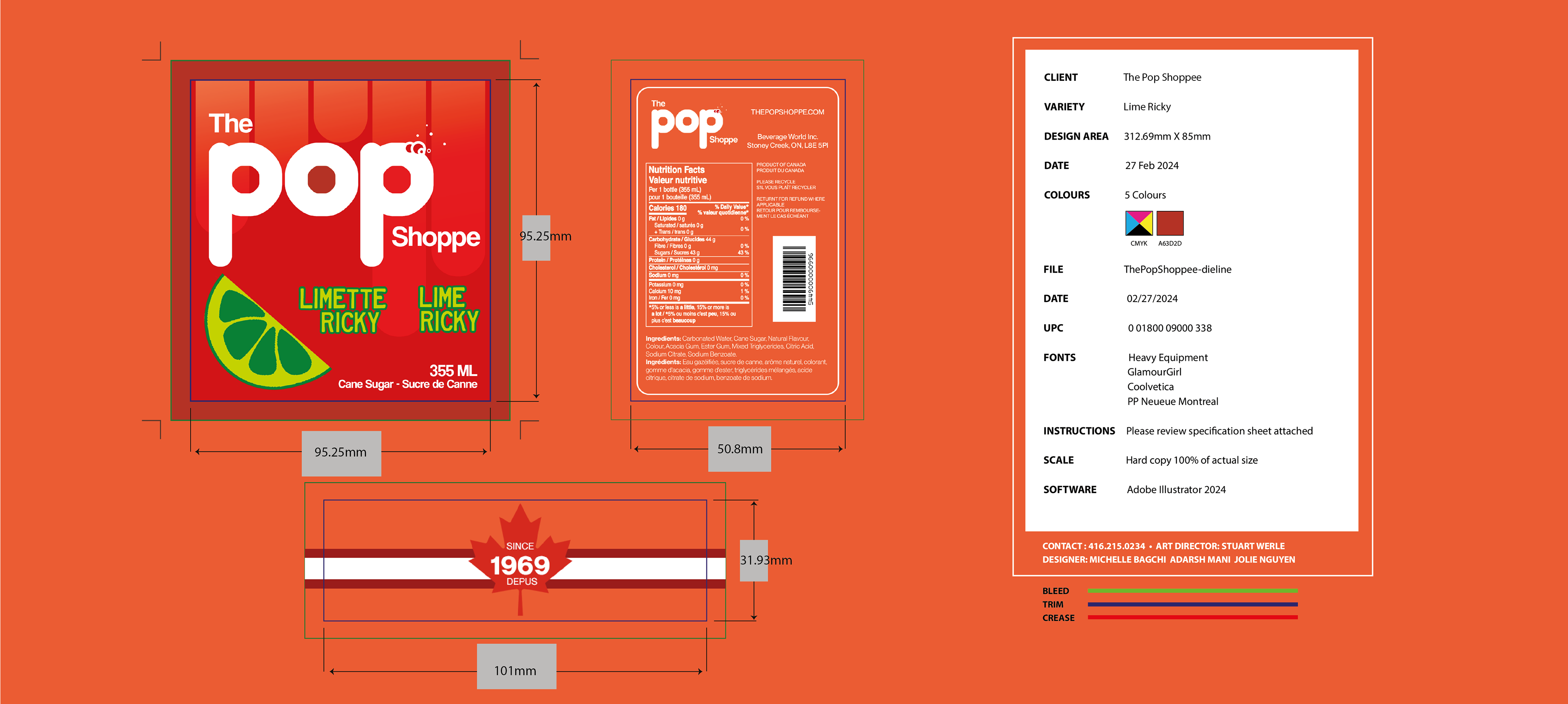
The result of this project was a packaging design that successfully captured the attention of younger consumers while preserving the brand’s retro identity.