Brand Identity
Quaro Software Inc. - Corporate Brand Identity Design
As part of a comprehensive rebranding initiative, Alludo and Quark decided to merge into a new entity named Quaro Software Inc. The objective of this project was to design a fresh and innovative corporate brand identity for Quaro, excluding any influence from the existing Alludo, Corel, and Quark logos. This extensive project included researching the brand name, exploring visual interpretations of key attributes, and developing a diverse range of logo concepts.
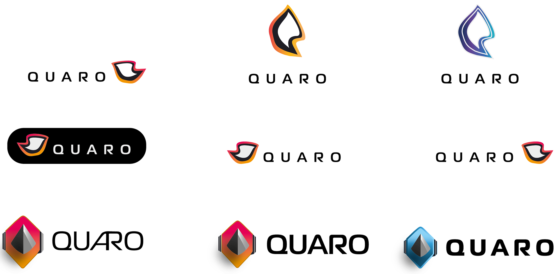
My explorations
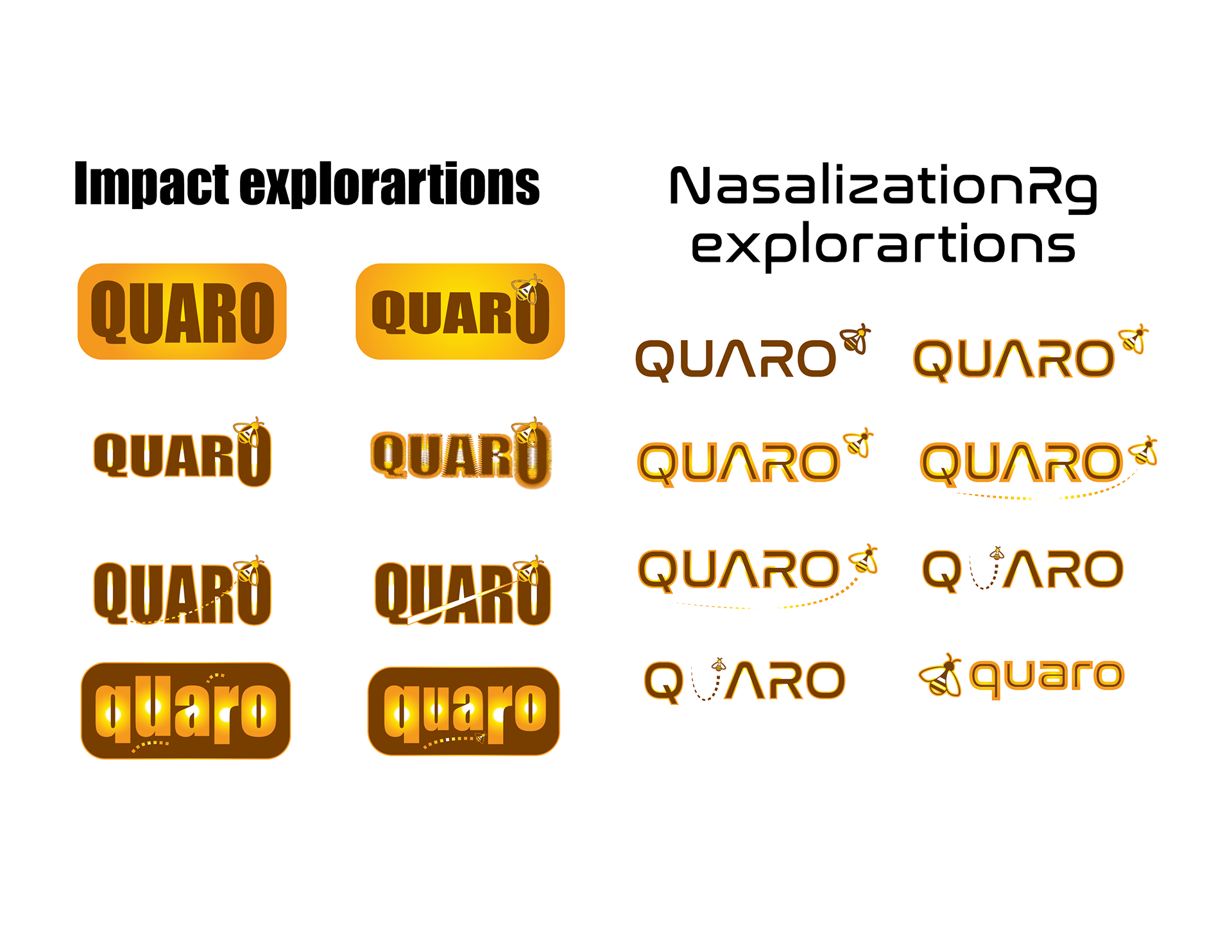


I explored various typographic possibilities for the brand name, experimenting with lowercase, uppercase, and mixed-case formats across a wide range of type styles. This exploration was crucial to discovering a typographic identity that would resonate with Quaro’s brand values and industry positioning.
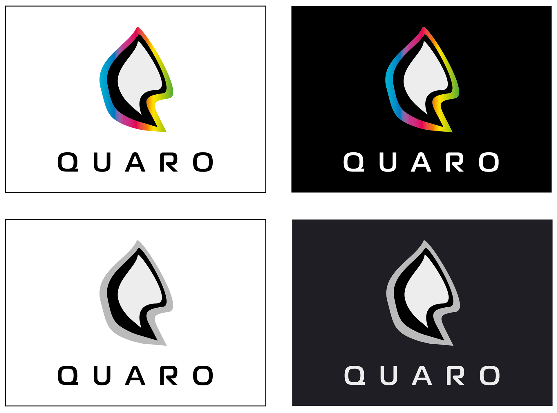
Final
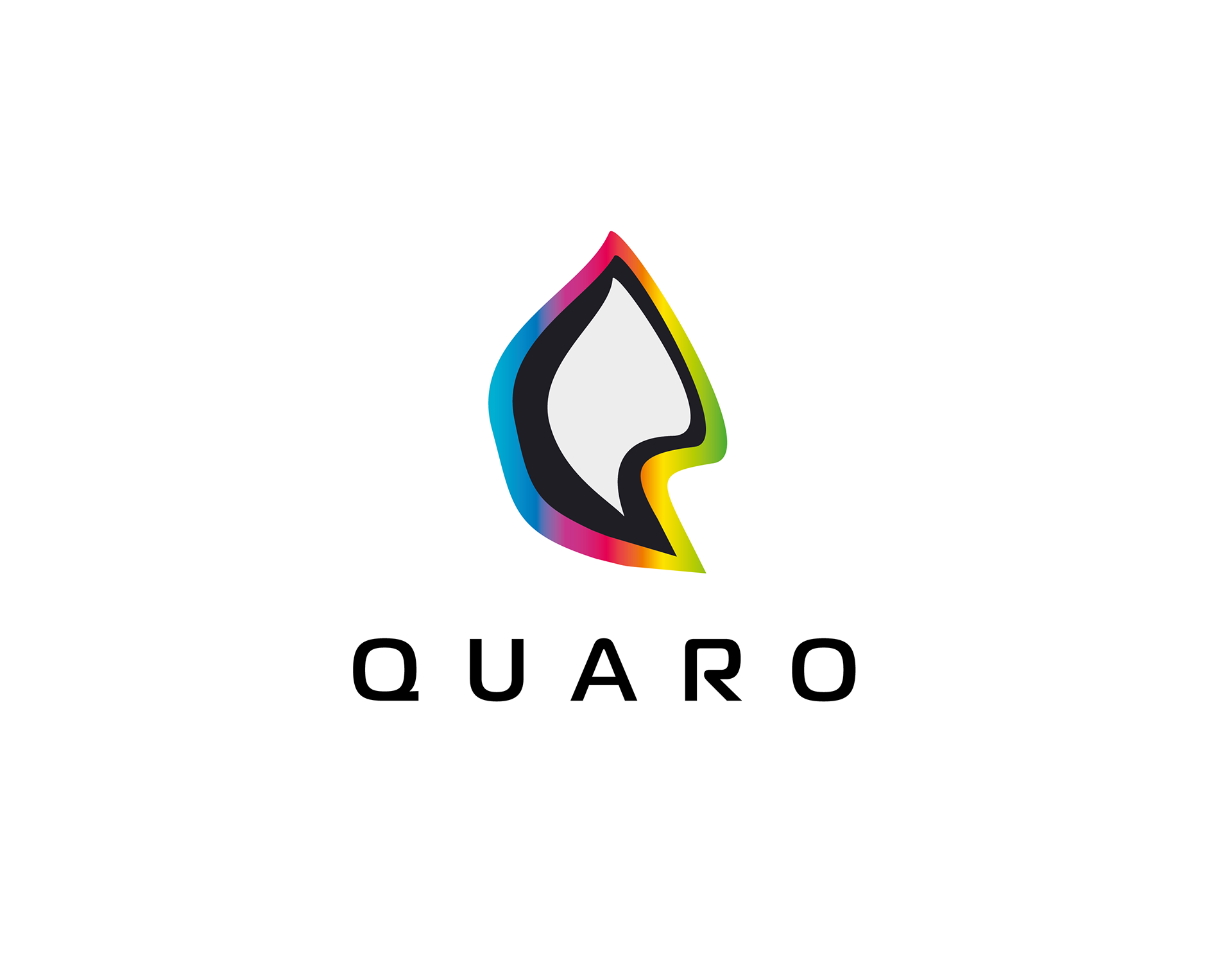
To capture the essence of Quaro Software Inc., I extracted colors from the original Quark and Alludo logos. The vibrant rainbow hues symbolized diversity and inclusivity, while also conveying a sense of friendliness and approachability that aligns well with the software industry.
Four Versions